Hydrow UI Language
Design Systems
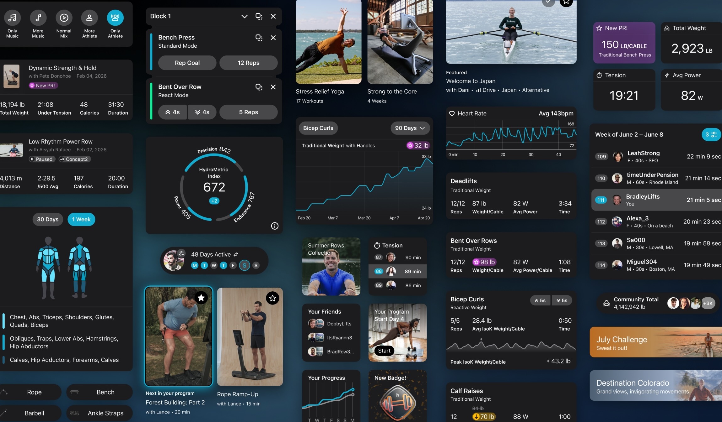
The start of development on Lyquid marked a sea-change moment for Hydrow. Not only were we expanding into a new modality, but on the design front, it also meant the start of a new user interface design language that would begin on Lyquid and then be applied to our other platforms.
I started building this design language from a truly blank canvas and ensured all aspects were thoughtful, scalable, and intuitive. The new Hydrow UI Language had to be flexible enough to work across the phone you carry in your pocket to our largest rower monitor.

The new Hydrow UI language is expansive yet easy to use, enabling members to transition fluidly between devices without losing familiarity.
Rebuilding all our components from the ground up in the new Hydrow UI language was exciting and rewarding. After establishing a strong foundation for layout, colors, and typography, I refined it with consistent iconography, microanimations, and navigation. Layering in rich workout statistics also enabled me to demonstrate my expertise in data visualization.
One of the largest changes with the new design language is how the color system functions under the hood. Previously, colors were named according to hue and tint. While handy for a marketing asset palette, it does not translate well to the structure of user interfaces. Instead, rebuilding the colors with semantic names greatly simplifies their application and enables us to easily establish a dramatic dark mode variant.

A color like “White” is not descriptive of where it should be used and how it should behave in dark mode. Rather, breaking it out into swatches like “Surface” and “Container on Surface” makes it clear which color to use in the layout and clearly dictates the hierarchy when shifted to dark mode.
Components were designed to adapt for different sizes. A tile like the Daily Activity displays a calendar of which days you’ve worked out. On a large rower monitor, this tile can show the entire month and current active streak. As space becomes more constrained, grids become condensed and less critical elements get consolidated or hidden. The system is flexible enough to support even the smallest application that just shows your current week activity.

No matter what aspect of the interface you’re using, elements feel connected and at home with each other. Things as subtle as corner radii and line dividers were no exception to being implemented with reason and consistency.
The way an interface design system looks is only one piece of the puzzle. The way it behaves and responds to the user tells them where things are coming from, where they go when hidden, and much more.
One area where this type of motion design has an impact is a dense screen like the Workout Details. When selecting the workout you want to dive into, the supporting content, such as descriptions, tags, and buttons, expands from the original tile you tapped.

This type of animation keeps the user grounded in where the information came from while retaining the mental path to how they got there and how to get back.
As a whole, rebuilding Hydrow’s interface design language from scratch was a joyous project. Getting to utilize all my design skills and push them even further is what I always aim to do—while adding clarity and ease to our members’ experiences.


