Lyquid Packaging System
Print Design
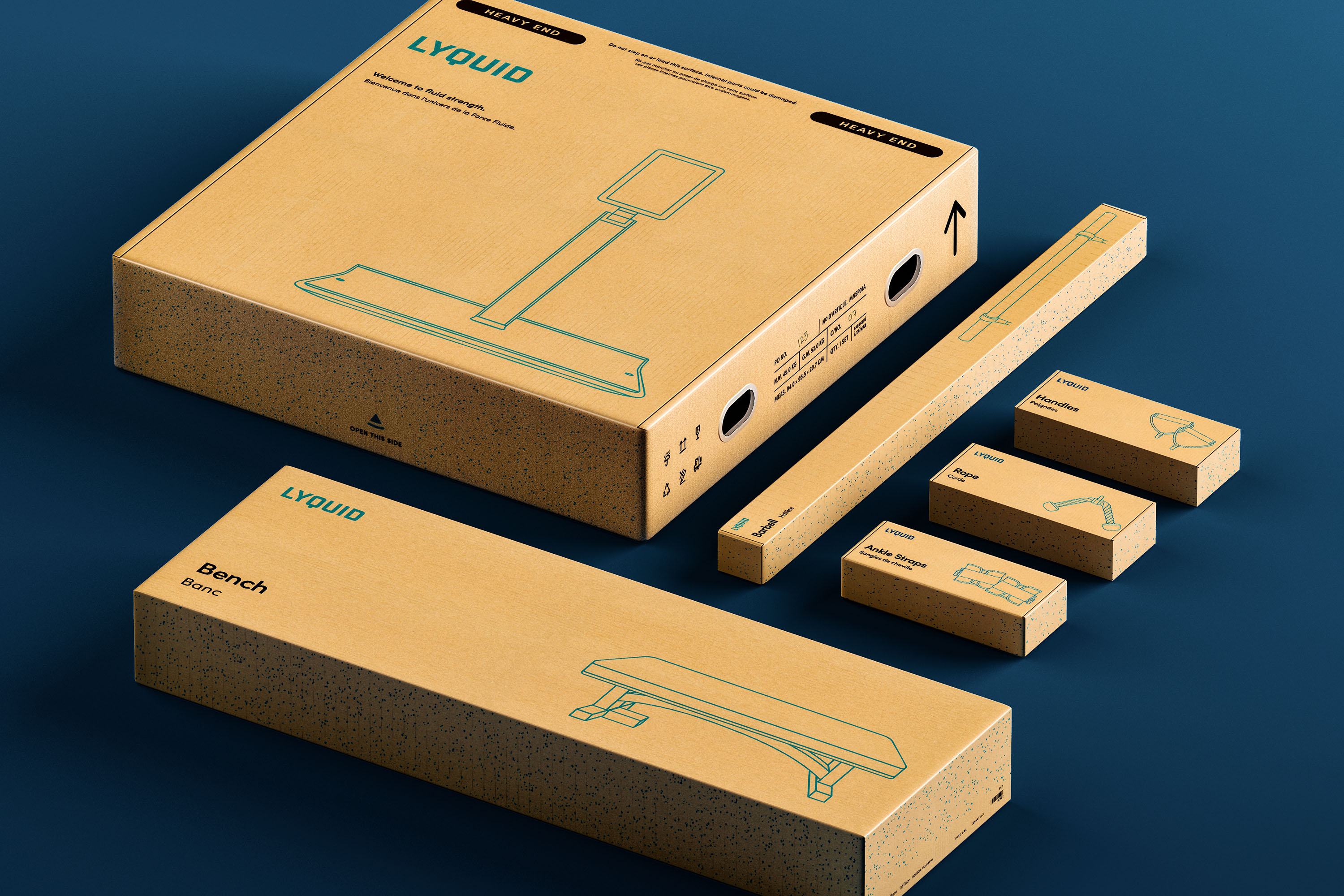
Lyquid is an efficient, versatile strength training platform in a surprisingly compact form factor. Its versatility stems from the extensive library of movements you can complete on it. Everything from bicep curls and lateral raises to bench presses and Romanian deadlifts. The accessories are what enable all these movements and bring the platform to life.
Since Lyquid is meant to be paired with accessories, the packaging needed to reflect it. I designed Lyquid’s entire packaging suite across the lineup of accessories, the machine itself, and all included Quick Start Guides and safety documents.
The packaging design system elevates the Lyquid unboxing experience at all touchpoints with subtle details that tie back to the hardware itself.


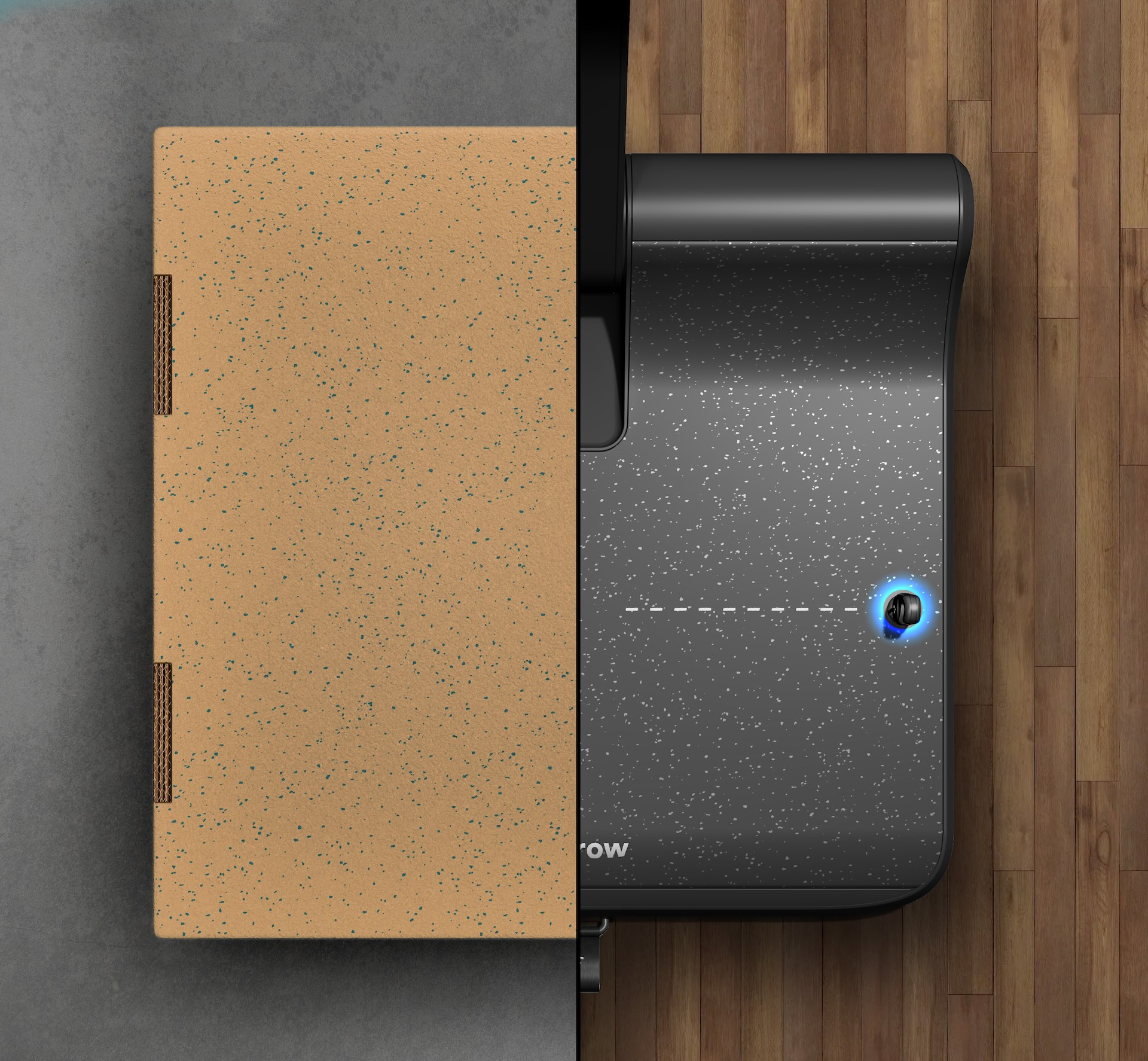
The boxes feature a speckle pattern on the sides and back. This pattern is a 1:1 scale recreation of the textured gym rubber on the base of Lyquid—adding a harmonious link between the unboxing and the machine hardware.
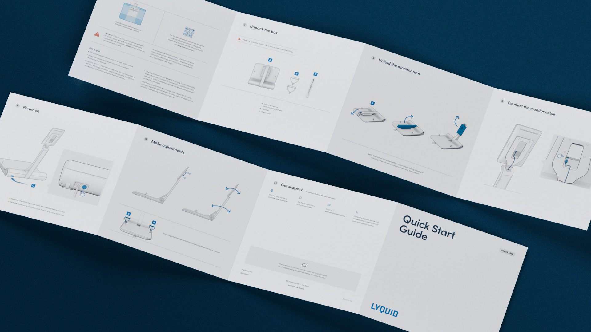
The Quick Start Guide was designed with easy-to-understand visuals to walk the user through setting up their Lyquid. Judicious use of a brand spot color established consistency and clear points of interest.
The Lyquid packaging system continues my work to elevate Hydrow’s design language across nearly all aspects of the user experience. From the moment you receive the machine to the start of your first workout, I’ve meticulously designed the experience to be cohesive and inviting